
Did you know that as many as 80% of all internet users now own a smart phone?* Did you know that smart mobile phones now offer the second most popular method of searching the internet?*
Whilst having a website optimised for display on a mobile phone may have been considered to be an added bonus for many businesses throughout the UK, a change in policy by Google in regards to how they display search results when viewed through a mobile device could leave you lagging behind your competitors if your website is not mobile optimised.
What Has Changed?
Previously, Google has added websites to its search results, regardless of how mobile friendly they are. However, from the 21st April this is all set to  change.
Google is quoted with the following:
“Starting April 21, we will be expanding our use of mobile-friendliness as a ranking signal. This change will affect mobile searches in all languages worldwide and will have a significant impact in our search results. Consequently, users will find it easier to get relevant, high quality search results that are optimised for their devices.”
For more on this please visit the following link – http://googlewebmastercentral.blogspot.co.uk/2015/02/finding-more-mobile-friendly-search.html
What Does Mobile Optimised Actually Mean?
The mobile optimisation of a website means that your standard ‘desktop’ website will be converted into a specific user-friendly format which can easily be read on any smart mobile device.
This conversion will ensure that all of the hard work is done for the user, ensuring they get the best possible experience when visiting your website.
The need for ‘zooming’ in order to read the content will be eliminated and the navigation will become far easier, therefore minimising the risk of hitting the wrong link.
Does This Mean That I Need An ‘App’ Developing?
Fortunately the answer to this is no. Web users tend to have distinctly different habits when it comes to mobile internet browsing and user apps on a phone. Whereas apps are often the preferred choice when it comes to social networking and online gaming, mobile browsers are still the clear number one choice when it comes to conducting online searches, browsing, shopping and entertainment.
The good news is that creating a mobile optimised site is significantly cheaper than producing an app, as well as being easier to manage, and offering effortless syncing between your website and your mobile optimised site.
Introducing Responsive Web Designs
Because of the significant increase in the use of tablets and smart phones to view the internet, the need to design websites which display to their 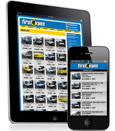 optimum abilities has never been greater and this is an aspect of web design in which we possess great experience.
To achieve the best possible results, creating a responsive web design will ensure that your website is optimised for display on all platforms.
These designs ensure that as well as your normal ‘desktop’ version, in an addition you will receive a ‘mobile’ version as well and this is where the term ‘responsive’ comes in.
Due to the way in which the designs are created the browser will be able to identify the type of device being used to view the website and will display the correct version accordingly.
The Good News Is…
Even if your website is not currently ‘mobile optimised’, we possess the skills needed to ensure that this is not the case for long!
Contact Us
If you would like more information regarding the creation of a mobile friendly version of your website, please contact us on Tel. No. 01883 372488 or via e-mail info@footprint.co.uk at we will be happy to run through your options.
*Source – http://www.smartinsights.com/mobile-marketing/mobile-marketing-analytics/mobile-marketing-statistics/