
How To Recall An Sent E-Mail Through Gmail
For a variety of reasons, many people have sent an e-mail that they wished they hadn’t. Whilst Gmail doesn’t offer the traditional “recall” function like Outlook, they instead offer a function that enables you to “unsend” a message within a certain amount of time.
Certain email programs offer an option to recall or retract an email, but that doesn’t necessarily mean the recipient won’t still receive it. Gmail’s Undo Send feature works differently in that it actually waits to send your email, giving you a certain amount of time to change your mind and prevent it from being sent. But you have to be quick, as Gmail gives you only a specific number of seconds to halt your email.
Here’s how to enable the “unsend” feature in Gmail and use it to your advantage.
Recall an email with Undo Send
If you decide you don’t want to send an email, you have a short time after to cancel it. Right after you send a message, you can retract it:
- In the bottom left, you’ll see “Message sent” and the option to “Undo” or “View message”.
- Click Undo.
Choose an amount of time to recall a message
- On your computer, go to Gmail.
- In the top right, click Settings
 Settings.
 - Next to “Undo Send,” select a Send cancellation period of 5, 10, 20, or 30 seconds.
 Settings.
Accessing Your E-Mails Whilst Offline
Another excellent and very useful feature offered by Gmail is the ability to access your emails even when you are not connected to the internet. To find out how, please check out the video below:
Further Information
If you’d like to speak to us regarding any of our services, please give us a call on 01883 372488 or contact us via Facebook and we’ll be happy to talk you through your options.
Currently Browsing: How To Recall An Sent E-Mail Through Gmail
How To Recall An Sent E-Mail Through Outlook
Message recall is only available after you click Send and is available only if both you and the recipient have an Office 365 or Microsoft Exchange email account in the same organisation.
To recall and replace a message
- In the folder pane on the left of the Outlook window, choose the Sent Items folder.
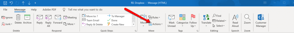
- Open the message that you want to recall. You must double-click to open the message. Selecting the message so it appears in the reading pane won’t allow you to recall the message.
- From the Message tab, select Actions > Recall This Message.
Notes:
- If you don’t see the Recall This Message command, you probably don’t have an Exchange account or the feature isn’t available within your organization.
- You cannot recall a message that’s protected by Azure Information Protection.
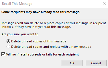
- Click Delete unread copies of this message or Delete unread copies and replace with a new message, and then click OK.
- If you’re sending a replacement message, compose the message, and then click Send.
To check on the recall
The success or failure of a message recall depends on the recipients’ settings in Outlook. In the following table, five scenarios are presented:
| Action | Result |
|
You send a message to someone. You recall the original message and replace it with a new one. On the recipient’s computer, under Tracking, the Automatically process requests and responses to meeting requests and polls check box is selected. Note: To view this setting, File > Options > Mail. Scroll to the Tracking section. |
Both the original message and the recall message are received in the recipient’s Inbox. Assuming the original message hasn’t been read, the original message is deleted and the recipient is informed that you, the sender, deleted the message from his or her mailbox. Note: If the original message is marked as read (viewing in the Reading Pane isn’t reading in this scenario) when the recall message is processed, the recipient is informed that you, the sender, want to delete the message. However, the message remains in the recipient’s Outlook folder. |
|
You send a message to someone. You recall the original message and replace it with a new one. On the recipient’s computer, under Tracking, the Automatically process requests and responses to meeting requests and polls check box isn’t selected. Note: To view this setting, File > Options > Mail. Scroll to the Tracking section. |
Both the original message and the recall message are received in the recipient’s Inbox. On the recipient’s computer, one of the following results occurs:
Note: If the original message is marked as read (viewing in the Reading Pane isn’t reading in this scenario) when the recall message is processed, the recipient is informed that you, the sender, want to delete the message. However, the message remains in the recipient’s Outlook folder. |
|
You send a message to someone. You recall the original message and replace it with a new one. On the recipient’s computer, either by rule or by action of the recipient, the original message is moved out of the Inbox to another folder and the recall message remains in the Inbox (or it is moved to another folder also). |
If the recall message and the original message exist in separate folders, the recipient receives a message that states a recall attempt failed. This occurs regardless of the Outlook configurations and the read status of the message. The original message and the new message are both available to the recipient. |
|
You send a message to someone. You recall the original message and replace it with a new one. On the recipient’s computer, either by rule or by action of the recipient, both messages are moved to the same folder. This results in behavior similar to what occurs when Outlook isn’t configured to automatically process messages. |
On the recipient’s computer, one of the following results occurs:
|
| You send a message to a public folder. You recall the original message and replace it with a new one. |
One of the following results occurs:
If a user who has any other public folder rights opens the recall message, the recall fails, and the user receives a message that states the recall failed. Both the old and new messages remain in the public folder.
|
Further Information
If you’d like to speak to us regarding any of our services, please give us a call on 01883 372488 or contact us via Facebook and we’ll be happy to talk you through your options.
Currently Browsing: How To Recall An Sent E-Mail Through Outlook
8 Tips To Write The Perfect Blog
Blogs, or ‘Web Logs’, are online journals that are updated frequently, sometimes even daily. An update, (also called an entry or a post) can be anything from just a few lines to pages and pages of text. The most effective blogs, however, typically contain between 400 & 600 words.
Engaging With Your Customers
Blogs are one of these best ways to engage your client base, advertise offers/opportunities and improve the visibility of your business online (SEO), and they are only going to become more important throughout 2019.
Your blog can be used for anything as well, not just information relating to your own business, but anything which you think your clients and customers would be interested – information that will keep them clicking onto your page.

Follow These Tips
Even the most seemingly random of topics, with the right voice, can be made over to appear interesting and relevant.
Follow these top tips when starting your blog:
- Decide upon and develop a writing style that is appropriate to your business. What would work best for your intended audience? Informal and chatty, or Formal and serious?
- Post regularly, even if they’re not all essays! At the very least once a week.
- Enable your readers to comment on your blog. This level of interaction is vital to the business-client relationship.
- Before you start blogging, spend some time visiting other blogs. You can learn a lot about the do’s and don’ts of blogging by reading others. Your suppliers’, rivals’, clients’ and other successful blogs are all mine of information.
- Make a note of everything you think could be turned into a blog. Keep a list of links to interesting news articles or developments, if an idea pops into your head when you’re not at your desk? Make a note of it on your phone!
- Use links and images. No one wants to look at a page full of dry text; appropriate and entertaining images break up the flow of the blog. They also provide invaluable keyword search opportunities, if properly labelled and tagged. Links in your blog to relevant pages on your site will keep people on your website! Links to other sites, or supporting articles add credence to your blog that is also crucial to your SEO.
- Use tags. Like keywords, tags can be used in blogs to highlight particular text to a search engine – all helping to attract other viewers to your blog and, ultimately, your website.
- Link your blog to all your social media channels. This will let all your followers know when new content has gone up – keeping them in the loop and encouraging them to visit your site.
If you keep all these points in mind, you’ll have no problem producing a relevant, interesting and successful blog.
Further Information
If you’d like to speak to us regarding any of our services, including our online marketing services, please give us a call on 01883 372488 or contact us via Facebook and we’ll be happy to talk you through your options.
Currently Browsing: 8 Tips To Write The Perfect Blog